
A pitch deck competition slide is not there to prove that everyone else is bad. Its job is to show three things on one slide: you understand the market, your difference is real and matters to customers, and that difference can last. Start by choosing the right format (positioning map, comparison table, landscape map or alternatives comparison), then pick the dimensions customers genuinely care about and place everyone on them honestly.
What investors are really asking
- Do you know this market? Missing an obvious competitor or workaround costs you more than admitting a rival is strong.
- Does your difference matter? "A nicer interface" rarely drives a purchase. "Setup in 10 minutes instead of several weeks" can.
- How long will it last? If a rival could copy it next quarter, expect questions about your moat: data, network effects, distribution, technology or cost structure.
Design the slide around these three questions and it will not turn into a checkmark poster.
Four formats and when to use each
| Format | Best when | Strength | Risk |
|---|---|---|---|
| 2x2 positioning map | Your edge fits on two dimensions | Visual, memorable, fast to explain | Biased axes look contrived |
| Feature comparison table | Your edge spans several capabilities | Complete and easy to probe | Becomes a column of checkmarks |
| Landscape map | A crowded space that needs grouping | Shows industry understanding | Dense; needs narration |
| Alternatives comparison | A new category with few direct rivals | Answers "what do customers do today?" | Underestimates switching costs |
Positioning map. Two axes, each a dimension customers care about, with your company usually in the top-right. Everything depends on choosing fair axes, covered below.
Comparison table. Rows are capabilities; columns are you plus three or four representative competitors. Keep it to five to seven rows that actually influence buying decisions. Mark honestly where others are strong. A table with some gaps on your side is more believable.
Landscape map. Group the players into categories, such as incumbents, startups and adjacent platforms, and show where you sit. Useful when the space is crowded and you want to demonstrate that you know it well.
Alternatives comparison. If you are creating a category, compare against what customers do today: manual work, spreadsheets, outsourcing. Show what the status quo costs and why switching is worth it.
How to pick fair axes for a 2x2
Check each axis against three tests:
- Customers care about it. It directly affects the buying decision, not just a spec sheet.
- It separates players. Competitors are spread out along it rather than clustered.
- The axes are independent. "Easy to use" and "fast to learn" are really the same axis twice.
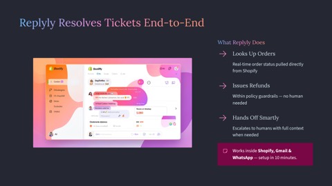
Take the English customer-support SaaS seed deck in our example gallery. Its input describes two kinds of competition: legacy helpdesks that bolted on AI suggestions but still need human agents, and FAQ chatbots that answer questions but cannot take action. That suggests:
- Horizontal axis: from "suggests replies" to "takes action," such as looking up orders and issuing refunds within policy.
- Vertical axis: from "weeks of configuration" to "live in 10 minutes."
Helpdesks and chatbots land on the left side; the product sits top-right. Both axes map directly to the customer's pain: support costs and slow response at peak season. An investor can repeat your positioning after one look.
Building the slide in five steps
- List every player: direct competitors, indirect competitors and workarounds. Be complete first, then trim.
- Find the five to seven dimensions customers care about, drawn from interviews, lost-deal reasons and questions your sales team hears, not from your own feature list.
- Pick the format: a map if your edge sits on two dimensions, a table if it spans several.
- Fill it in fairly: record where others are strong and date your information, for example "based on public information as of Q3 2026."
- Write a conclusion as the headline, such as "Existing tools suggest replies; we resolve the ticket," and keep a detailed comparison in the appendix.
The competition slide usually sits after traction and before the team; see our pitch deck structure guide for the full order.
Mistakes investors notice
- "We have no competitors." It always draws a follow-up and weakens your credibility on the market.
- A full column of checkmarks. Winning on every row reads as marketing, not analysis.
- Disparaging rivals. Describe their limitations factually; loaded language looks unprofessional.
- Self-serving dimensions. Comparing on features only you have, which customers do not actually value.
- Stale information. Marking a rival "not supported" for a feature they shipped six months ago is hard to recover from in the room.
Generating the competition slide with AI
In our AI slide studio, add "use a 2x2 positioning map for the competition slide" in the extra instructions when you generate a pitch deck, and include your dimensions and competitor categories in the business plan text. The exported PPTX stays fully editable, so you can fine-tune where each player sits.
The English SaaS seed example shows the original input and the 11-slide deck it produced, including the competition slide. If you are pitching international investors, our guide to the English pitch deck for global startups covers the rest. When you are ready, start in the pitch deck generator.
FAQ
Can I say "we have no competitors" on the slide?
Avoid it. Even without direct rivals there are alternatives: manual work, spreadsheets, outsourcing, or the customer's current process. Claiming no competition makes investors wonder whether you understand the market, or whether the need exists at all.
Should I name competitors on the slide?
In a deck for investors, usually yes, because it helps them judge the landscape. A public version can use category names instead. Either way, describe others accurately, avoid disparaging language, and note when the information was current.
Should I use a positioning map or a comparison table?
Use a positioning map when your difference fits on two dimensions; it is visual and memorable. Use a table when your edge spans several specific capabilities. A common pattern is the map in the main deck and the detailed table in the appendix.
A strong competition slide leaves investors feeling you know the space better than they do. Choose fair dimensions, describe everyone honestly, and let the tooling handle the layout so you can spend your time rehearsing.



 Editorial Team