
A LinkedIn carousel hook actually lives in two places: the first two lines of your post and the cover of your PDF. The first decides whether people tap "see more"; the second decides whether they start swiping. Strong LinkedIn carousel hooks share four ingredients: a specific number, a clear audience, a bit of tension and a promise you can keep. Below are eight cover templates you can adapt, plus a worked rewrite of a real carousel about scaling a remote team.
Your hook has two jobs in two places
| Location | Reader's state | Hook's job | What to write |
|---|---|---|---|
| First two lines of the post | Scrolling fast; the rest is truncated | Earn the "see more" tap or a pause on the document | Context, conflict or a surprising fact |
| PDF cover | Looking at the document, deciding whether to swipe | Get them to page 2 | One concrete promise in one line |
The two don't need to match word for word. A useful division of labor: the post answers "why read this now?" and the cover answers "what will I get if I swipe?"
Four ingredients of a strong hook
- Specific. Numbers, timeframes and scale beat adjectives. "From 8 to 80 people" lands harder than "a growing team."
- Relevant. The right reader should instantly see it's for them: name "founders" or "remote managers" outright.
- Tension. Contrast, surprise or the opposite of common practice makes people want the reason.
- Deliverable. Every promise on the cover gets paid off in the pages that follow.
You don't need all four in one line, but "specific" and "deliverable" are non-negotiable.
Eight cover templates
| Pattern | Template | Example |
|---|---|---|
| Numbered lessons | [Number] lessons from [experience] | 5 lessons from scaling a remote team |
| Result and timeframe | How we went from [A] to [B] in [time] | How we went from 8 to 80 people in 3 years |
| Before and after | From [A] to [B]: what changed | From 23 tools to 9: what we cut and why |
| Mistakes | [Number] mistakes we made with [topic] | 3 mistakes we made hiring our first managers |
| Contrarian | Stop [common practice]. Do this instead. | Stop scheduling status meetings. Write them. |
| Audience callout | [Audience]: read this before [action] | Founders: read this before going remote |
| Question | Why do [group] [problem]? | Why do remote teams stall at 30 people? |
| Framework | The [N]-page [tool] we use for [situation] | The 1-page decision doc we use for every call |
Two rules when you use them: replace every bracket with your own real details, and make sure every number on the cover is explained somewhere inside.
A worked rewrite
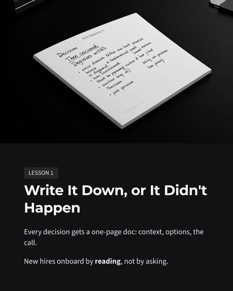
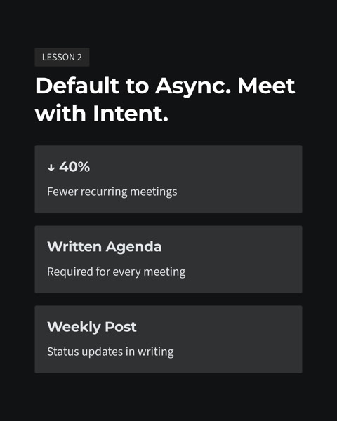
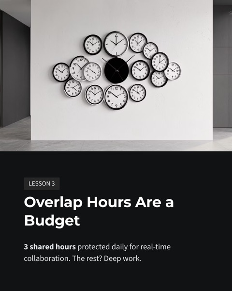
Our gallery includes a carousel built from a long post titled "5 lessons from scaling a fully remote team from 8 to 80 people." Here's how the cover could evolve:
- Before: Some thoughts on remote work
- Version 1: 5 lessons from scaling a remote team
- Version 2: 5 lessons from scaling a remote team from 8 to 80 people
- Version 3: 8 people, 1 time zone → 80 people, 14 countries. 5 lessons.
The original has no number, no audience and no promise. Version 1 adds a count. Version 2 adds scale. Version 3 uses before-and-after to create tension. The matching post opening might read: "Three years ago we were 8 people in one time zone. Today we're 80 across 14 countries." The post tells the story of change; the cover promises five lessons. They complement rather than repeat each other.
Designing the cover around the hook
- Set the main line large, six to twelve words, readable in one glance on a phone.
- Put supporting detail in a subtitle at a clearly smaller size.
- Consider adding your name or photo. LinkedIn is a network of people, and readers lean toward a named person's experience.
- Add a small swipe cue in a corner, such as "Swipe →", so it's obvious the document has more pages.
- Keep the background simple so nothing competes with the headline.
Page 2 has to catch what the hook threw
Plenty of carousels have a decent cover and then spend page 2 on an introduction or a long setup, and that's where readers tend to leave. Page 2 should pay off the cover immediately: jump straight into lesson one, or give one line of context and then the first conclusion. Move "About me" to the final page, or leave it to your profile.
Test hooks in five steps
- Write ten different cover lines for the same content, using as many different patterns as you can.
- Score each on the four ingredients and keep three.
- Mock up all three at phone size and see which reads fastest.
- Show them to someone in your target audience and ask whether they'd swipe, and why.
- Over the following weeks, rotate patterns across posts and note swipe-through and comment quality, until you learn what works for your audience.
Hooks to avoid
- Engagement bait. "Comment YES if you agree" tends to read as cheap.
- Unsourced numbers. If someone asks where a figure came from and you can't say, your credibility takes the hit.
- Off-topic controversy. Picking a fight to get attention pulls the comments away from your actual point.
- All mystery, no information. "You won't believe what happened" gets little traction on a professional network.
Drafting and comparing covers with AI
When you choose LinkedIn in our AI slide studio's article-to-carousel workflow, you get a page-by-page outline before anything is generated. Swap the cover line for one of the templates above, confirm, and download a 4:5 portrait PDF. To see how different visual styles frame the same hook, use one-click restyle to generate another version. The remote-team carousel is in our gallery: open the remote team carousel example for the full input and every page.
For upload steps and sizing, see our LinkedIn carousel guide. If you also publish on Xiaohongshu, compare with the Xiaohongshu cover formula: the hook logic transfers, the tone does not.
FAQ
How long should a LinkedIn carousel cover title be?
Six to twelve words is a safe range, short enough to read at a glance on a phone. A number, an audience and a result are the three key ingredients; everything else can go in a subtitle or on page 2.
Should the post text and the PDF cover say the same thing?
Not exactly. The first two lines of the post earn the "see more" tap, and the cover earns the first swipe, so they should complement each other. Let the post set up the context or tension, and let the cover make the concrete promise, such as "5 lessons from scaling a remote team".
Can a hook use a controversial opinion?
Yes, as long as the following pages back it up with evidence. Manufacturing conflict for attention, or using numbers you cannot source, damages your credibility, and on a professional network that cost outweighs any extra reach.
Before your next carousel, spend ten minutes writing ten cover lines and keep the one you can fully deliver on. Then hand the content to the carousel studio for layout and export.


 Editorial Team