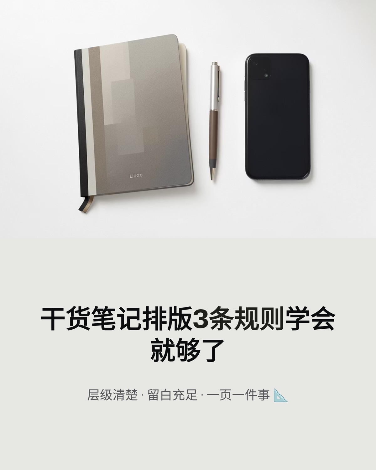
Good how-to post layout for Xiaohongshu comes down to three things: a clear hierarchy, generous white space and one idea per card. On top of that, almost any educational post can be built from seven inside-card layouts: the big number, steps, comparison, checklist, flow, quote and summary. Below are the rules to set before you design, how each layout works, and a full eight-card example using a budgeting post.
Set three rules before you design
Most messy carousels aren't a talent problem. They happen because nobody set rules, so every card gets improvised. Write these down first:
| Rule | What to do | Common mistake |
|---|---|---|
| Three text levels | Headline, body, note. Headline about twice the body size | Five or six font sizes on one card, so nothing leads |
| Three colors at most | One background, one text, one accent; accent only for numbers and key terms | A new color for every subhead |
| Fixed alignment and margins | Left-align multi-line text; center only covers and quotes; same margins everywhere | Centered on one card, left-aligned on the next, so the layout jumps |
Once these are fixed, the set has a skeleton. Every layout below is just a different arrangement inside it.
Seven inside-card layouts
1. Big number
One number dominates the card with a short label beside it, such as "50% · 4,000 yuan · Living account". Use it for percentages, amounts, durations and counts. Make the number very large and set the unit and label a size smaller.
2. Steps
Number + action headline + one line of explanation, two or three steps per card. Style the step numbers the same way throughout, for example a digit inside a colored circle, so readers instantly see where they are.
3. Comparison
Split the card left-right or top-bottom into "do this" and "not this", separated by color or icons. Ideal for corrections, mistakes to avoid, and before-and-after. Keep both sides about the same length so the card stays balanced.
4. Checklist
Four to six short lines, each starting with the same symbol or icon. Keep every item to a single line. If one runs longer, it probably deserves its own card.
5. Flow
Three to five nodes connected by arrows, horizontal or vertical. For example: "Payday → automatic transfers → four accounts → weekly review." It explains sequence and mechanics far faster than prose.
6. Quote
One sentence, centered, large, surrounded by space. Good for the problem card or a turning point, because it changes the pace. One per set is plenty; more feels empty.
7. Summary
Every key point on one card, as a table, grid or numbered list. This is often the card people screenshot and keep, so it must make sense on its own without the rest of the set.
A full example: the 4-account budgeting method
Our gallery's 4-account budgeting carousel started as a long beginner's budgeting post. Here's how its eight cards map to layouts:
| Card | Layout | Content |
|---|---|---|
| 1 | Cover (big type) | Saving 30,000 yuan a year on an 8,000-yuan salary with 4 accounts |
| 2 | Quote | Three years of living paycheck to paycheck |
| 3 | Big number | Living account: 50%, 4,000 yuan |
| 4 | Big number | Emergency account: 10%, 800 yuan, until it covers 3 to 6 months of expenses |
| 5 | Big number | Savings and investing: 25%, 2,000 yuan, transferred on payday |
| 6 | Big number | Fun account: 15%, 1,200 yuan |
| 7 | Checklist | Three habits: automatic transfers, weekly review, a 7-day wait on big purchases |
| 8 | Summary | All four ratios at a glance + which account will you open first? |
Look at cards 3 to 6: four big-number cards in a row, with the number in the same position, size and color every time. That's deliberate repetition, not laziness. Readers can compare the four ratios as they swipe, and the rhythm feels intentional. Repeating a layout is a design choice in itself.
Five details that make cards easier to scan
- Emphasize sparingly. Bold or color one or two key terms per card. If everything is bold, nothing is.
- Use emoji as markers, not words. They work as bullets or a touch of tone; keep it to three per card.
- Add page numbers. A small "3/8" in the corner tells readers where they are and how much is left.
- Fix the footer. Put your handle or series name in the same spot at the bottom of every card, so the source travels with screenshots.
- Respect Chinese typesetting. Add a space between Chinese and Latin text or numerals, don't let punctuation start a line, and use Arabic numerals consistently.
Pre-publish checklist
- Thumbnail test: shrink each card to half a phone's width; the headline is still readable.
- Word count: short headline, no more than five lines of body.
- Hierarchy: each card has a single focal point.
- Color: no more than three main colors, accent only on numbers and key terms.
- Alignment: cards of the same type share alignment and margins.
- Page numbers and footer: present on every card, always in the same place.
- Summary card: understandable on its own as a screenshot.
For exact ratios, margins and font sizes, see the Xiaohongshu image size guide. If you run several channels and want every carousel to look like it came from the same brand, read our guide to brand-consistent social carousels.
Let a style template do the layout
Rules are hard to keep when every post starts from a blank canvas. Our AI slide studio offers 26 curated styles and 100 themes. In the article-to-carousel workflow, paste your how-to article, choose Xiaohongshu and a style, and the same hierarchy, palette and margins apply to every card. Add a brand kit and your logo, footer and page numbers land in the same position each time. The export is a 4:5 PNG image set, and if a style doesn't suit the topic, one-click restyle regenerates it in another.
FAQ
How much text should one Xiaohongshu card hold?
For Chinese copy, a 6 to 14 character headline and three to five lines of body text, roughly 40 to 80 characters. Beyond that, readers have to zoom on a phone, so split it into two cards. Bold or color the key numbers and terms to help scanning.
Which fonts work for how-to posts?
Use a clean sans-serif for body text and a heavier weight or a distinctive display face for headlines, with no more than two typefaces across the set. Check the license before commercial use to avoid copyright issues.
Does every card need an image?
No. In a how-to post the information is the star and images play a supporting role. Use illustrations or icons on the cover and a few concept cards, and keep step and checklist cards as clean text layouts, which are easier to read.
Layout exists so readers spend less effort getting your advice. Set the rules, pick the layouts, run the checklist, and if you'd rather skip the repetitive part, hand the article to the carousel studio and spend your time on the content.


 Editorial Team